Site Structure (map)
This is to lay down the site structure, much like a site map for the duration of the development of the project.
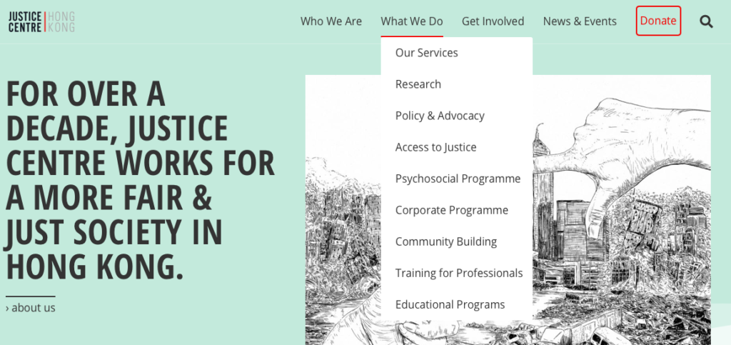
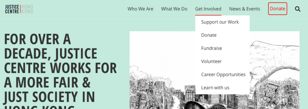
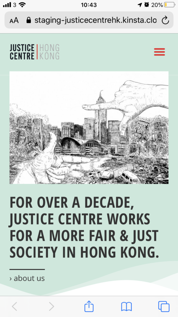
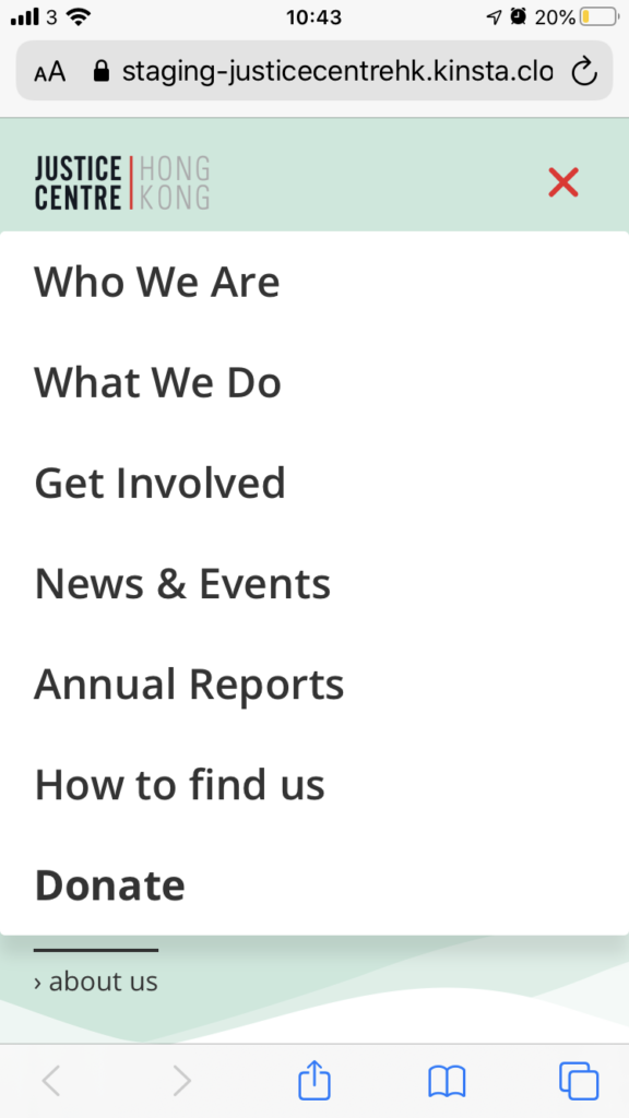
It will show Desktop structure and Mobile structure as far as the difference can be found in the main menu.
This is a useful base reference for the creation of the copywriting documents by Kindred.
Site Map
Here is the base site map showing the structure of the site. It is worth noting that pages are independent from each other and exist with their own URLs.
However the main menu will organise them in a nested form, for ease of navigation.
Legend:
– Bold Titles signify Top Level pages.
– Bullets signify sections of a page.
– Number list signify sub pages.
Homepage
- section 1: Top intro visual
- section 2: intro about us
- section 3: teaser what we do
- section 4: teaser with statistics
- section 5: three latest news (auto)
Who We Are
- About Us (Top Level Page)
- Staff
- Board of Directors / Partners
- Annual Reports
- How to find us
What We Do
- How We Work (Top Level Page)
- Research
- Policy & Advocacy
- Access to Justice
- Psychosocial Programme
- Corporate Programme
- Community Building
- Training for professionals
- Educational Programme
Get Involved
- Support our work (Top level Page)
- Donate
- Fundraise
- Volunteer
- Work With Us
- Learn With Us
News & Events
- Top Announcement area
- Featured News
- All news
Main Menu
The main menu is divided into 2 distinct menus. The Desktop menu and the responsive mobile menu. Because visitors don’t consume a website the same way on computer and on mobile, it is crucial to provide a simplified menu for smaller devices.
Desktop menu
The desktop menu refers to the main menu for devices such as large computers or laptops. This menu is fully opened and uses a dropdown system to display sub level pages.
Notice we don’t have more than 1 level dropdown. This is because anything more get confusing for visitors and physically hard to reach with fiddly mouse movements.
The Top Level Pages are repeated as the 1st choice in the dropdowns because it is common for people to miss those pages if they are only linked from the top links.


Mobile menu
Mobile menu is used from tablets to smartphones.
Because visitors don’t consume a website the same way when they have smaller devices or on the go, it is important to design a menu that is simpler and more direct. So we do not use Dropdowns in this case. We provide directly access to Top Level Pages, and add other pages in the list (such as how to find us).


Top Level Pages (breakdown)
In this part we will see each top level page in details in terms of what structure they will have. They will be composed of sections which segments the page and give access to further content. Top level pages can be understood as “Sub Landing Pages”, where they introduce further content found deeper.
Homepage
The homepage is the main landing page. It introduces the website content, and serves the purpose of giving a brief overview of the site (should visitor leave from this page).
visuals coming soon…
Who We Are
This is the equivalent of an “About us” page. As top level page, it will introduce the company with a good overview of deeper content.
Then it dispatches sub level pages with a system of categories, which visitor can follow to go “deeper”. Similar to what is found in the dropdown of the main desktop menu.
visuals coming soon…
What We Do
The same way “Who We Are” is, this serves a similar purpose to present the work and different services.
visuals coming soon…
Get Involved
This is also a top level page introducing the different way people can participate. It dispatches to different sub pages as well.
visuals coming soon…
News & Events
The main page of News & Event regroups the different types of posts used on the site (with a grid based layout, sectioned into categories).
The sections help curate the content and drive visitors towards what they might be interested to read.
To animate the page, we think the top part should be fixed and provide a voice, with the use of “announcements”.
visuals coming soon…
News & Events (post)
Each post has its own URL. They exist on their own and can easily be shared.
They are assigned categories, which in turns helps automatically pull bunch of posts into an area of the site, or when curating the main grid page (above).
For example the category “Feature” helps pulling articles into the reserved area of the main page. (below announcements).
visuals coming soon…
